
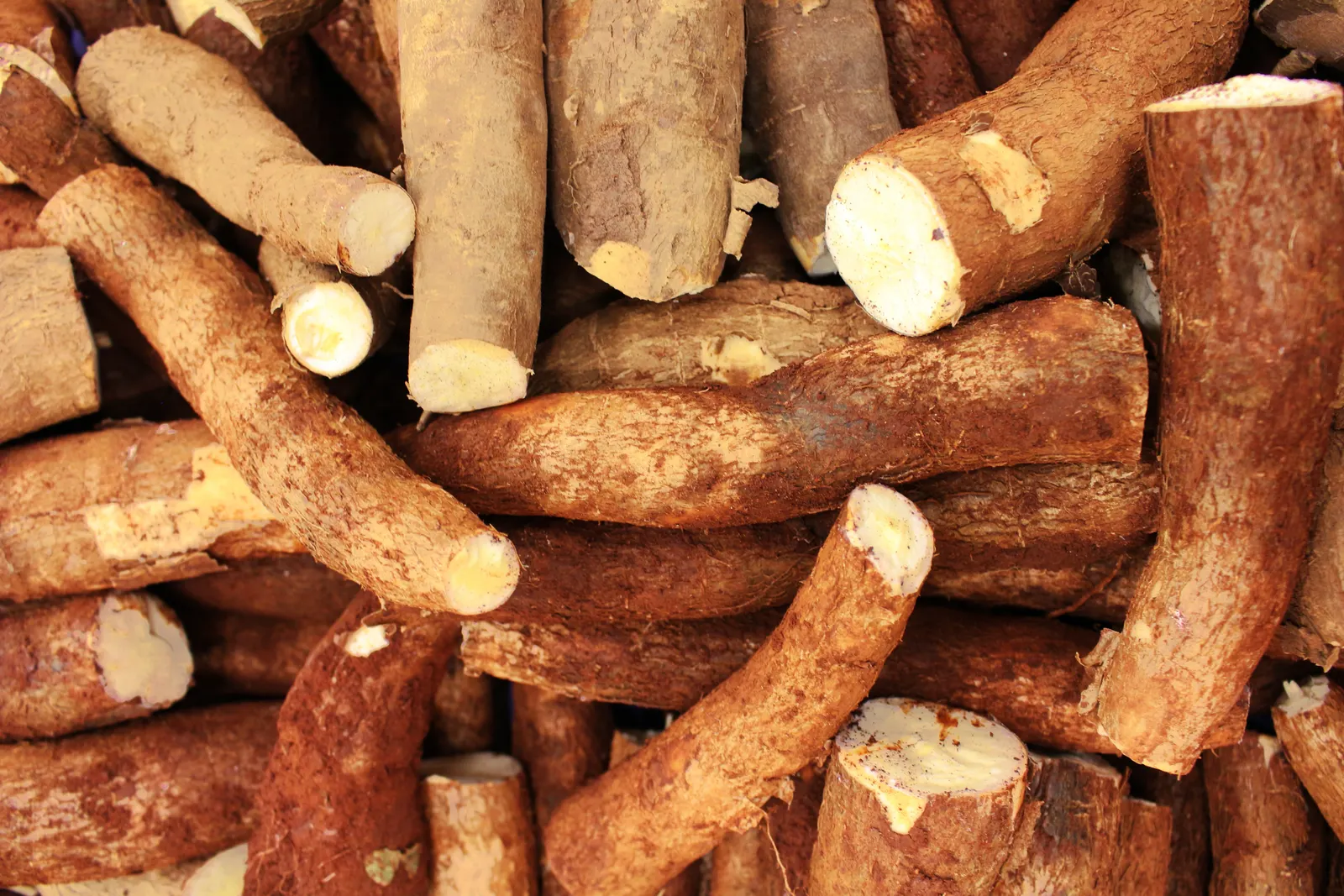
 Pexels · illustrative photography ↗
Design guidelines
MaOL visual system
A consistent look.
A recognisable MaOL.
A practical guide to the colours, typography, imagery and interface elements used in this website design.
✳ MaOL brand assets
Our logo.
Use the supplied artwork at its original proportions, with clear space around it. Choose a background that keeps the logo visible.


Primary colour
Deep green anchors navigation, footer areas and primary text treatments.
Secondary colour
Pale green highlights calls to action and key accents.
Greyscale
Neutral tones provide calm backgrounds and clear text hierarchy.
System colours
Supporting interface colours for meaningful messages, always paired with text.
Typography
Inter.
One readable family, with a clear hierarchy. Responsive page titles scale down on smaller screens.
H1 · 72 px reference
Nigerian roots. Greater possibilities.
H2 · 48 px reference
More from every cassava root.
H3 · 32 px reference
From farm to factory.
H4 · 24 px reference
Familiar food. Fresh perspective.
Body · 16 px reference
MaOL connects locally sourced cassava with food, industrial and commercial products.
Small · 12 px reference
Clear product information, one detail at a time.
Buttons & interactions
Clear next steps.
Pill-shaped actions, visible keyboard focus and concise labels. Examples below link to real website destinations.
Image & logo treatment
Keep it recognisable.
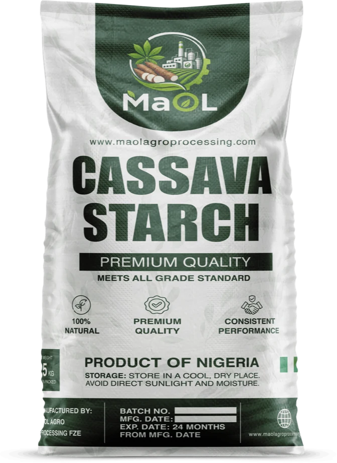
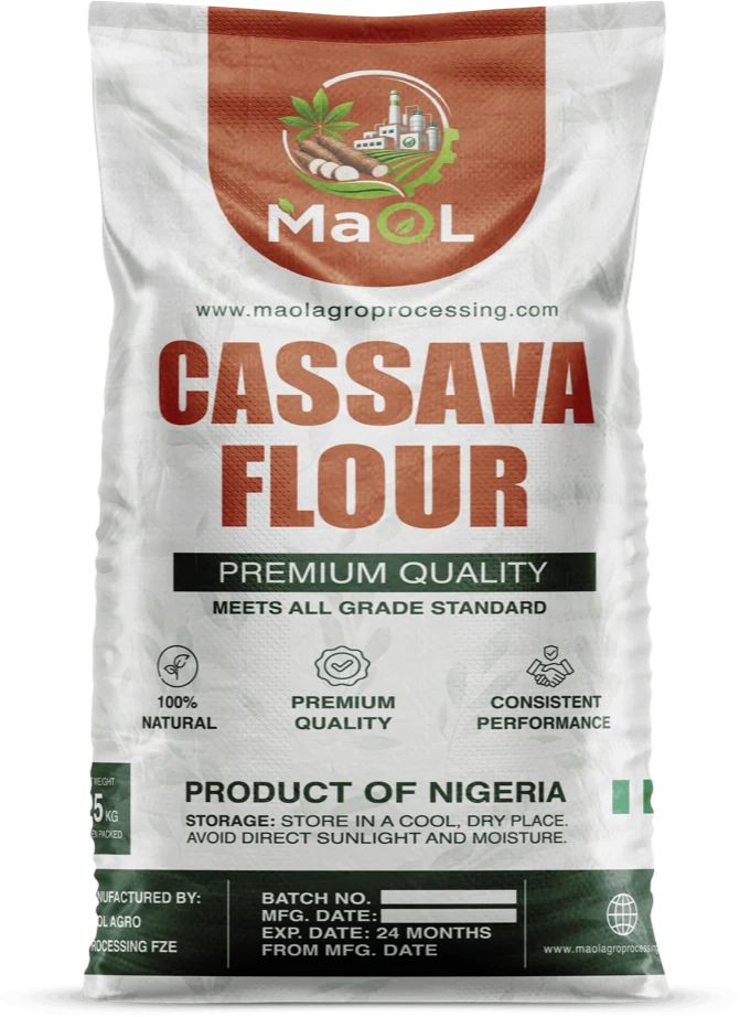
Use the supplied MaOL logo, real product artwork and relevant agricultural imagery.

Preserve the logo’s proportions and keep adequate clear space.
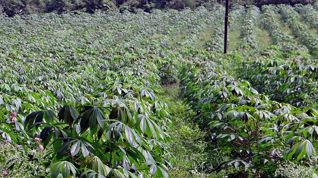
Use rounded photo frames, dark gradients and readable light text for page headers.
✳ Our flagship ingredientsTwo ingredients.
Two ingredients.
A world of possibility.
Discover two versatile cassava ingredients for food manufacturers, formulators and commercial buyers. Explore product data and discuss supply.
Good roots. A consistent story.
Explore how this visual direction comes together across the MaOL website.
View the homepage ↗